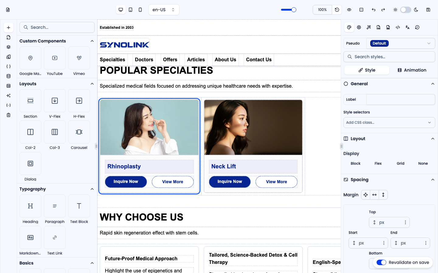
The Blocks group holds pre-assembled page sections. Drop one in and customise the text, images and links — a fast way to lay out a page.
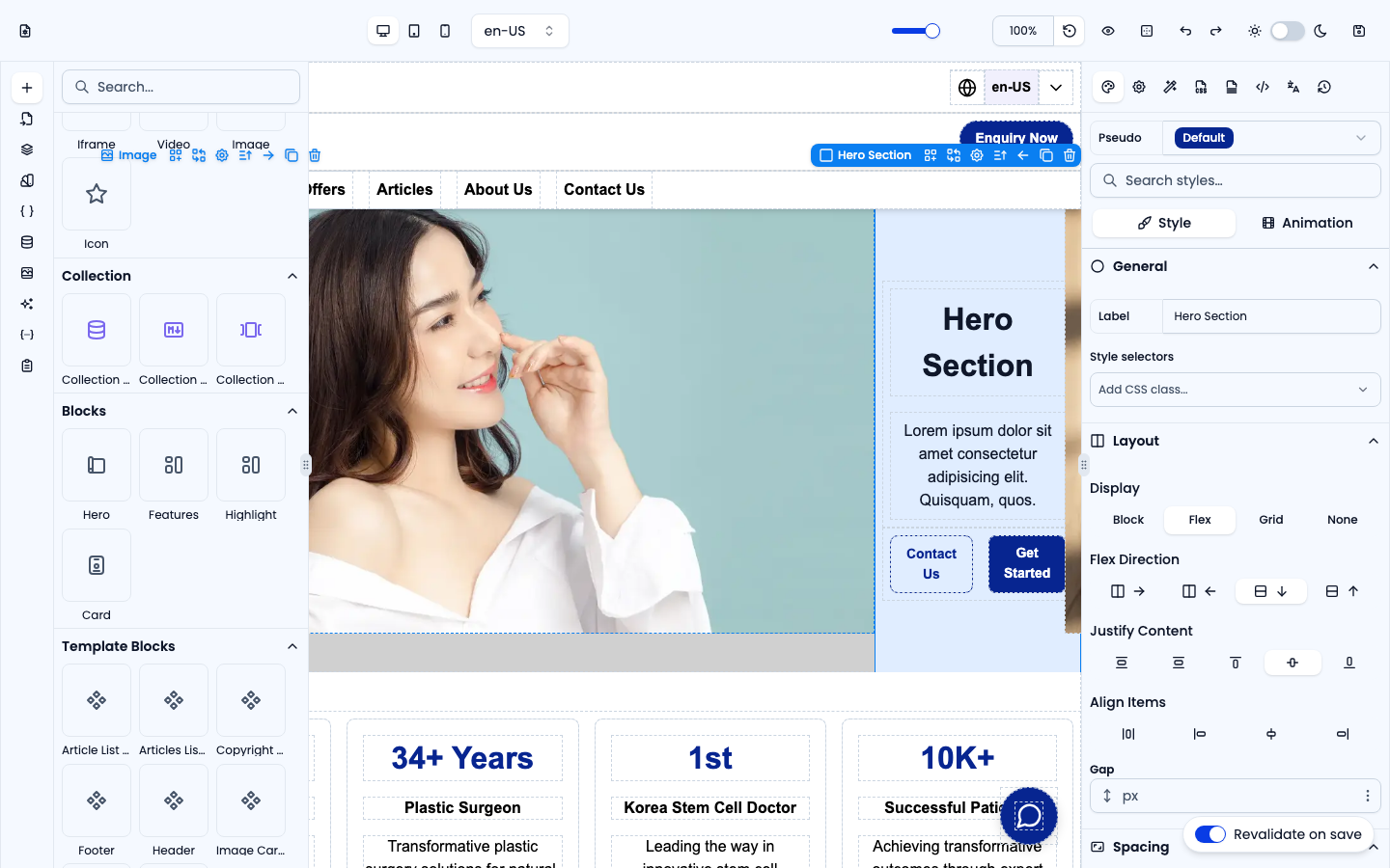
Hero
A full-width hero band with a heading, description and two call-to-action buttons. Usually the first section of a landing page.
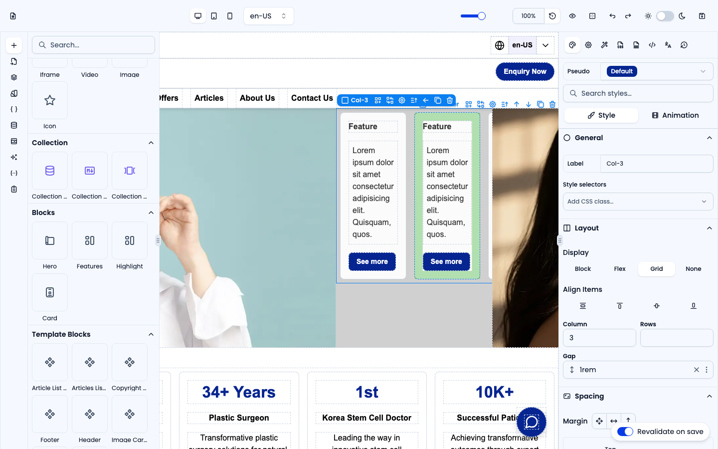
Features
A three-column grid of feature cards — each card has a heading, body text and a "See more" link. Collapses to fewer columns on smaller screens.
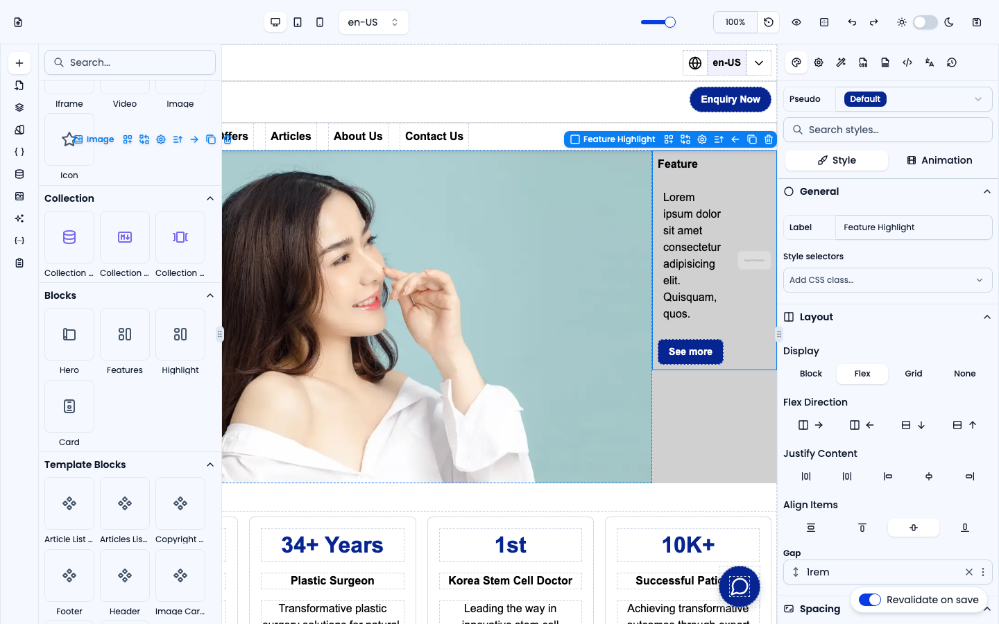
Highlight
A side-by-side layout: feature text (heading, body, button) on one side and an image on the other. Good for alternating feature rows.
Card
A single card with a title, a 16:9 image, description text and a link button.