A detailed walkthrough of the page editor screen, with real screenshots. For the basic editing flow, see Using the Page Editor first.
The full screen
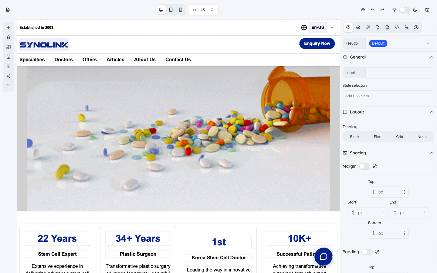
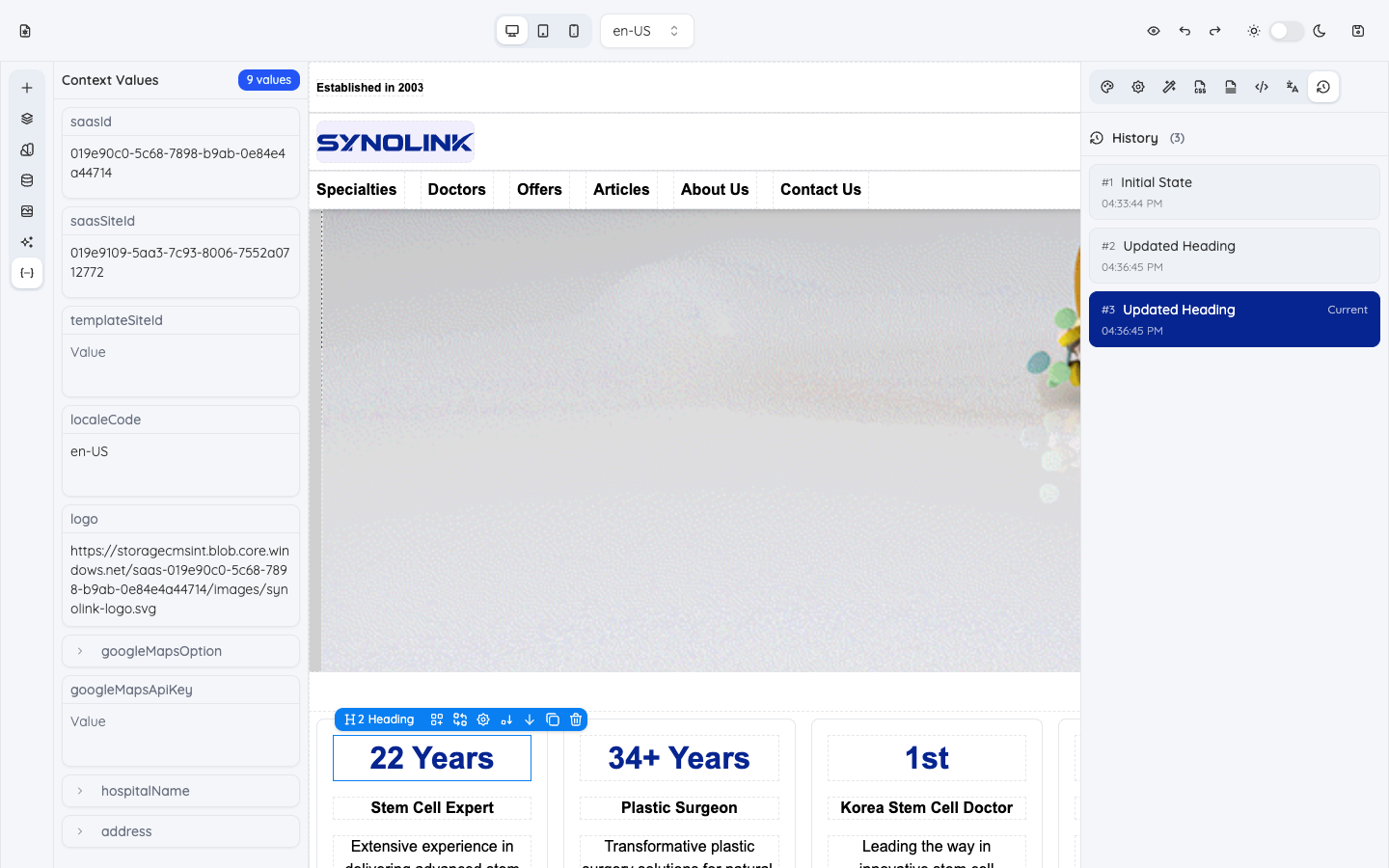
The editor has four areas: top toolbar · left panel · center canvas · right panel.
| Area | Role |
|---|---|
| Top toolbar | Switch screen size, language, undo/redo, preview, save |
| Left panel | "What to add" — elements, structure, data |
| Canvas | The live page you edit (click to select) |
| Right panel | "How it looks" — styles and settings of the selected element |
Top toolbar
- Screen size — Switch between desktop / tablet / mobile to check each device.
- Language — Choose the language to edit/preview (multilingual sites).
- Undo / redo, preview (hide editing chrome to see the real look), save.
Changes take effect only after you save, and you must publish (deploy) separately to make them public.
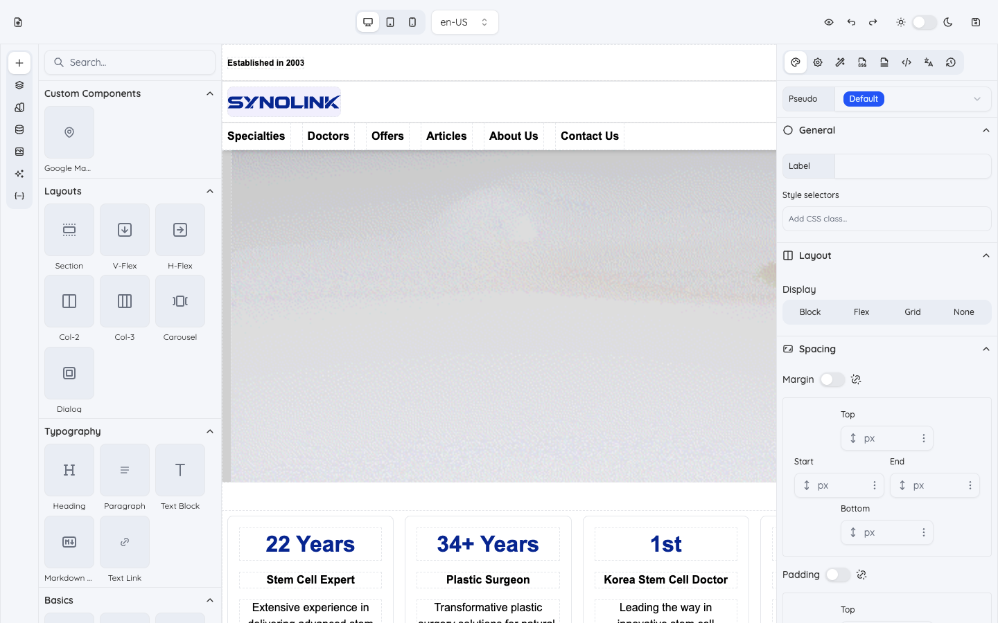
Left panel — elements and data
Switch panels using the vertical icons on the left.
| Panel | What it does |
|---|---|
| Elements | Drag text, images, buttons, layouts, etc. onto the canvas |
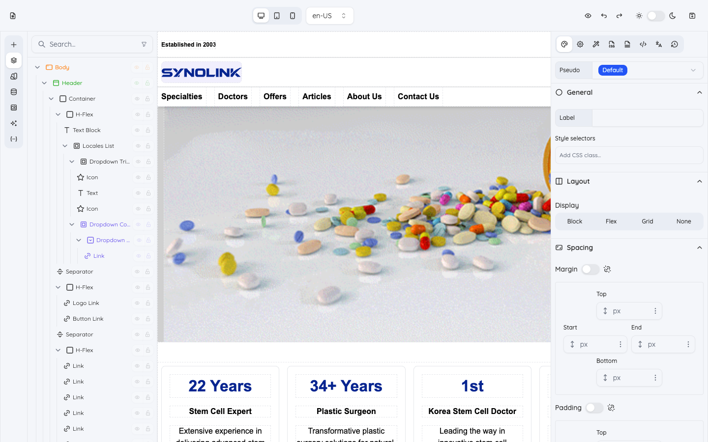
| Layers | View the page's element tree to select and organize |
| Variables | Manage design values like brand colors, sizes, fonts |
| CMS | Bind elements to dynamic data (doctors, departments, etc.) |
| Assets | Pick media such as images and icons |
| AI Prompt | Generate elements from natural language |
| Context Values | Inspect values used on the page (org info, etc.) |
For detailed usage of the CMS, AI Prompt, and I18n panels, see the Data, AI & Translation guide.
Adding elements
Find an element under categories like Custom Components / Layouts / Typography / Basics and drag it onto the canvas.
Layers
The hierarchy of elements that make up the page — handy for finding nested or overlapping elements quickly.
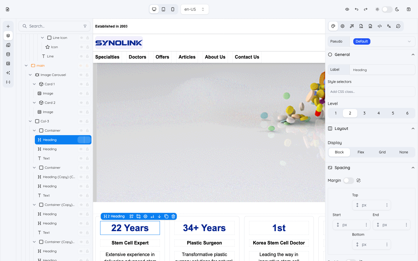
Canvas — selecting elements
Click an element on the canvas to select it (an outline appears); the right panel then reflects that element. Quick-action buttons also appear above the selection.
Right panel — styles and settings
Switch panels using the icons at the top right.
| Panel | What it does |
|---|---|
| Style | Color, spacing, size, fonts, background, border, effects |
| Settings | Per-element properties (form fields, image settings, links) |
| Actions | Wire up interactions (open a popup, etc.) |
| CSS | Write CSS directly on the selected element (advanced) |
| Stylesheet | Write a page-wide stylesheet (advanced) |
| Metadata | Page SEO (title, description, etc.) |
| I18n | Manage per-language content |
| History | Edit history — revert to an earlier state |
The Style panel is split into General, Layout, Spacing, Dimensions, Typography, Position, Backgrounds, Borders, and Effects — and you can set them per device (desktop/tablet/mobile) for responsive design.
Context Values and History
Below, the left Context Values and the right History are both open. History lets you step back through your edits.
Summary
- Drag from Elements on the left → 2. click on the canvas to select and enter content → 3. style it with Styles on the right → 4. configure data / language / metadata → 5. check in preview → 6. save, then publish.